I know that good lighting and clean backgrounds (especially white backgrounds) are what many strive for, so when setting up to take my first product photos, this was my aim too. I started out with a very basic set up and have ended up with a pretty sweet, homemade light box.
Here is the evolution of my light box:
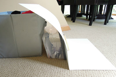 |
| My super basic photo set up |
#1: As Basic As It Gets
White background - check.
Natural light - check.
My pictures should be awesome, right? - nope.
So, how basic is basic? As you can see in the picture, basic for me meant white poster board propped up against random household objects and placed on the floor in natural light. I probably looked really silly laying on my stomach on the floor trying to get in close to take my pictures. I'm glad my husband wasn't home during my photo shoots!
At first, I thought that my pictures looked great with this set up, and I was super excited about getting all my items photographed. After being on Etsy for a short while, I realized that the pictures I took with this set up were not great and that the grayish background had to go. Here's an example:
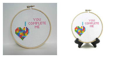 |
| From my first photo shoot to my new light box + minor editing |
#2: My First Light Box
I won't go into great detail here because this light box sucked.
My first light box began its life as a plain old brown cardboard box. I used this tutorial to help me. The materials were easy to find (a cardboard box, tissue paper, tape, white poster board), and the process took less time than I thought it would. I removed the top flaps of the box and cut out panels on the left and right sides. Then, I taped sheets of white tissue paper over each side cut out. I used the poster board as the background for the picture. I got two cheapy desk lamps from Target and pimped them out with full spectrum light bulbs from Amazon. Full spectrum bulbs are more expensive, but they will help you get a nice, white light that you can't get with regular bulbs. They really help improve light box photos. The lamps are positioned next the tissue paper covered cut outs, shining into the box.
Using this light box, I was able to control my lighting much better than I could with natural light, but I still couldn't get nice, white photos (even with photo editing). I always had shadows in the corners/edges of my photos, and cropping didn't always fix the problem. After reading more about light boxes online, I realized that one problem was that the inside of my box wasn't white. Light wasn't bouncing off of the brown areas, which created the shadows. I could probably have gotten away with taping some white paper inside the box, but I had a better idea. I'd start with material that was already white had a stronger structure.
I wish I had a picture of this light box, but after many hours trying get good photos using it, I destroyed it in frustration.
#3: My Second Light Box
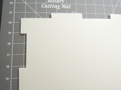 |
| An example of the "tabs" |
To make the light box, you start out by cutting down your pieces of foam core into squares. Then, you have to carefully plan out where you'll cut out tabs on the edges of intersecting walls of the box. If you cut the tabs correctly, your box walls should fit together like a 3D puzzle. Use the poster board inside the box as a seamless background. Shine desk lamps on the inside walls on the left and right (this is the thing that ultimately didn't work for me and led to my third light box).
I was so excited to have this new light box finished. I wanted to retake all of my photos and update all my Etsy listings. But, I took one series of photos with it and knew something still needed to be tweaked. My photos were just as bad as the ones I took with my brown cardboard box, ugly shadows everywhere. Shining the lights on the solid inside walls of the box made it very difficult to bounce the light in the right places. But, then, I had an idea! What if I made cut outs on the left and right sides, covered them with white tissue paper, and shined the light through the paper like I did with my first light box? Brilliant!
I really wish I had taken step-by-step photos of the process, but when I made my light box, I wasn't planning to share it with anyone. You can see step by step pictures in the tutorial I linked. And, again, I don't have a picture of this version of my light box, but it's the same as my 3rd/current light box except that the sides were left whole.
#4: My Third (and Hopefully Final) Light Box
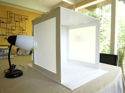 |
| My current light box - I'm very happy with it. :) |
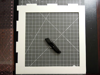 |
| One cut out before being covered with white tissue paper |
Another realization I had while putting this together was that the "white" poster board I was using wasn't really pure white, and it was affecting my photos negatively. So, I used some very white drawing paper meant for an easel for my back drop. It's lighter weight than poster board, so I needed to find a way to anchor it in place so it wouldn't slide down inside the box. The solution I came up with was to cut tabs at the top end of the paper and feed the tabs through the gaps at the top of the light box. The top piece of the light box helps hold the paper in place. You can see what I mean in the picture below. Another thing I like about using easel drawing paper is that I have a whole roll of it, and it's easy to swap in a new piece if my background paper gets dirty or marked up from moving things around on top of it.
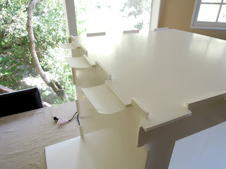 |
| Paper "tabs" hanging out the back of the light box |
* In my pictures, you can see that my box is sitting on top of another piece of white foam core. This piece is not necessary for making or using your light box. I had an extra piece laying around, so I use it as a base for my box.

Your light box looks great! I thought about making one myself but most of the items that I photograph are too big.
ReplyDeleteHmm . . . big items. That does make things more difficult!
DeleteGreat information, I wish more etsy sellers were willing to experiment and develop like you. Then we would see way more beautiful photography on etsy!
ReplyDeleteThanks, Sonya. At first, I thought it would be really difficult to make my own light box (that would actually work well), but it really didn't take much time or money. Everyone on Etsy talks about editing photos, but it helps if you get better photos to start with. Etsy needs more light boxes! :)
DeleteHoly crap that's a very precise light box, but your photos look great! Excellent job!
ReplyDeleteThanks, Megan. :)
Delete